Web Components
Web Components are a part of the HTML standard that allows the front-end developer to build component-based web applications.
Component based application development has become very popular with tool-kits like React, Angular and Vue. The idea is that we break down the appearance and functionality of our web application into components that can be developed and tested more or less in isolation. A component might be the banner heading on your page, a table to display data, a form to interact with the user, or a card to display product information. You write each of these as components and then put them together to create your whole application.
Web Components provides a way to do this using core web technologies rather than third-party tools. The capability is built into every modern browser, so you can just write Javascript code linked to an HTML page to make use of it. The idea actually makes use of three separate standards:
- Custom elements - the ability to define a new HTML element like
<card-display>and associate Javascript code with it to be run when the element is used in a document. - Shadow DOM - the ability to have a separate DOM representation behind a custom element so that the HTML and CSS used by that element don't interfere with the main page.
- HTML Templates - a built in template mechanism to make building re-usable HTML structures easier.
Custom Elements
The HTML standard allows us to use any element name in a page, even if it isn't
defined in the standard. So I can invent a new element <spot></spot> and use it
in my document. The browser will not know what to do with it so will effectively
treat it like <span></span> - it will not affect the page layout at all but will
appear in the DOM. I can attach a CSS style rule to this new element and the browser
will render it just like it was a 'real' element:
<spot style="color: blue; background-color: yellow;">Out Damn Spot!</spot>
In the HTML standard, an unknown element like this is interpreted as HTMLUnkownElement which means
that while it is allowed, it doesn't have the same DOM interface as a real element
(HTMLElement). However, a special type of unknown element is treated differently,
that is those that have a valid custom element name; that is, one containing
a hyphen (dash) character like <my-spot>, <info-card> or <login-form>. These
elements are treated as valid elements and the custom element standard means that
we can define the behaviour of these new elements with Javascript as well as their appearance with CSS.
Here's an example of a custom element with some style defined, at this point it
is just like the <spot> element above.
<!DOCTYPE html>
<html>
    <head>
        <title>Web Components Sampler</title>
        <style type="text/css">
            demo-component {
                display: block;
                background-color: red;
                width: 200px;
                height: 200px;
            }
        </style>
        <script src="script.js" defer></script>
    </head>
    <body>
        <h1>Web Component Sampler</h1>
        <demo-component>
            <p>Hello World</p>
        </demo-component>
    </body>
</html>
Adding Javascript
The new element <demo-component> just acts as a wrapper around the paragraph
content and will appear as a 200 pixel red square. The next part of defining a
custom element is to attach some Javascript code that will be run at different
points in the life-cycle of the element. This is done in the script.js file
by defining a new class that extends the built-in HTMLElement class. Here is
a simple example.
class DemoComponent extends HTMLElement {

    connectedCallback () {
        this.innerHTML = `
        <h2>DEMO</h2>
        <p class="demo">I am a demonstration of custom elements!</p>`;
        console.log('rendered', this);
    }
}

customElements.define('demo-component', DemoComponent);
The class DemoComponent defines one method connectedCallback which is
code that will be called whenever this element is inserted into the DOM - that is
when an HTML file containing your element is parsed or some Javascript code
inserts the element into an existing DOM. In my example above, I modify
the innerHTML of the element to have some new content which will replace
the 'Hello World' paragraph that was already there. I used a Javascript
string template to do this (note the backticks ``` rather than single quote
around the string) since these can be multi-lined and later will allow
inserting variables into the content.
The console.log line will output to the browser console when this code
is called. When you run this code, check the console and inspect
the element that is printed out.
The last line of Javascript is critical as this is where we associate the
DemoComponent class with the <demo-component> element. The names
are similar by convention but we are just attaching a class to an
element name. Note that the element name must start with a lower case letter and
consist of lower case letters including unicode characters, numbers, '.' or '_' and must contain one '-' character. This means you can have special characters like <math-α>
or <emotion-😍> but not eg. <Capital-x> or <spot> (Reference).
Adding Style
In my example, the CSS style associated with the new element is contained in the main page. It would be better to have the layout of the new component be defined within the Javscript code to make it more modular and stand-alone. We know that we can modify the style of any HTML element from Javascript so we just do that now in this next version:
class DemoComponent extends HTMLElement {
    connectedCallback () {
        console.log('rendered', this);
        this.innerHTML = `
        <h2>DEMO</h2>
        <p class="demo">I am a demonstration of custom elements!</p>`;
        this.style = `
            display: block;
            background-color: red;
            width: 200px;
            height: 200px;
        `
    }
}
Now the <style> block in the main page is not needed. When the new element is
created we can insert the style directly into the element and our implementation
is now self contained.
Note that this way of adding style is different to the stylesheet rule that we had
before in that it only applies to this instance of <demo-component> rather than
all of these elements in the page.
Element Properties
So far, the custom element will be the same every time it is used. It would be more useful to be able to control aspects of the element when it is created. We can do this using element attributes. Let's build a version of the new element where we can optionally control the size and colour of the square via an input attribute. In use it will look like this:
    <body>
        <h1>Web Component Sampler</h1>
        <demo-component size="300px"></demo-component>
        <demo-component size="120px" color="pink"></demo-component>
    </body>
(I'm using the US spelling of colour for consistency with other CSS attribute
names). To implement this we need to access the attributes of the element
and use them when we generate the element style in the connectedCallback. The
first thing though is to introduce the constructor of the class which will
be called when the element is created. In the constructor we will save
the values from the attributes, setting defaults if they are not present.
In the connectedCallback we use the values of the size and color
attributes to insert into the CSS string value that we use to update
the element style attribute. We can also insert these values into the
innerHTML content:
class DemoComponent extends HTMLElement {

    constructor () {
        super();
        this.size = this.getAttribute('size') || '200px';
        this.color = this.getAttribute('color') || 'red';
        console.log('constructed', this.size, this.color);
    }

    connectedCallback () {
        console.log('rendered', this);
        this.innerHTML = `
        <h2>DEMO</h2>
        <p class="demo">I am a demonstration of custom elements!</p>
        <p>Size is ${this.size}. Colour is ${this.color}.`;
        this.style = `
            display: block;
            background-color: ${this.color};
            width: ${this.size};
            height: ${this.size};
        `
    }
}

customElements.define('demo-component', DemoComponent);
In the constructor, we first call the super() function - this ensures
that the constructor of the parent class (HTMLElement) is called (this has
to be done explicitly in Javascript). We then use an or-expression
to store either the value of the attributes or the default if that is not set.
Shadow DOM
The purpose of the Shadow DOM is to provide encapsulation - isolating the internal workings of our custom element from the rest of the DOM structure. In the first example of why this is an advantage we'll show how it 'protects' the internal parts of our element from global stylesheets.
Here's the example custom element modified to use the shadow DOM:
class ShadowDemoComponent extends HTMLElement {

    constructor () {
        super();
        this.size = this.getAttribute('size') || '200px';
        this.color = this.getAttribute('color') || 'red';
        this.attachShadow({ mode: 'open'});
        console.log('constructed', this.size, this.color);
    }

    connectedCallback () {
        console.log('rendered', this);
        const wrapper = document.createElement('div');
        wrapper.innerHTML = `
        <h2>DEMO</h2>
        <p class="demo">I am a demonstration of custom elements!</p>
        <p>Size is ${this.size}. Colour is ${this.color}.`;

        const style = document.createElement('style');
        style.textContent = `
        :host {
            display: block;
            background-color: ${this.color};
            width: ${this.size};
            height: ${this.size};
        }
        p {
            font-family: sans-serif;
        }
        `
        this.shadowRoot.append(style, wrapper);
    }
}

customElements.define('demo-shadow', ShadowDemoComponent);
In the constructor, we call this.attachShadow to attach a new shadow DOM
to this new element. We use {mode: 'open'} which will allow the internals
to be accessed from outside Javascript code ({mode: 'closed'} would block this).
In the connectedCallback, instead of modifying the innerHTML of the custom
element we create a new wrapper element (a <div>) and insert the content
into that. While setting the style attribute of the custom element would
still work, we take a different approach here and create a <style> element
and set the text content to a mini-stylesheet for our new element. The
:host selector in the stylesheet refers to the host element of the shadow
DOM - our custom element.
The stylesheet rule for paragraphs in the custom element will only apply to
paragraphs within the shadow DOM, not to any paragraphs in the outside document.
In addition, any rules for paragraphs in the main document won't apply inside
the shadow DOM. If we modify the main HTML page as follows to provide
a global paragraph style, it will apply to the original <demo-component>
element but not to our new shadow DOM version.
<!DOCTYPE html>
<html>
    <head>
        <title>Web Components Sampler</title>
        <script src="script.js" defer></script>
        <style type="text/css">
            .container {
                display: flex;
            }
            demo-component {
                margin: 10px;
            }
            p {
                font-size: 25pt;
            }
        </style>
    </head>
    <body>
        <h1>Web Component Sampler</h1>
        <div class="container">
            <demo-component size="300px"></demo-component>
            <demo-shadow size="200px" color="pink"></demo-shadow>
            <demo-component size="300px" color="yellow"></demo-component>
        </div>
    </body>
</html>
Here's a screenshot of the result:
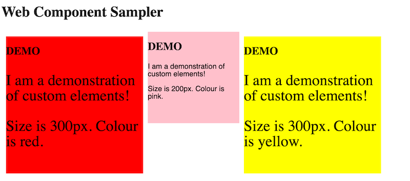 .
.
The two original components contain paragraphs that are affected by the global style rule. The shadow component is not and the local paragraph rule applies to change the font family.
So, the shadow DOM provides an enhanced level of encapsulation to our custom element which will insulate it from changes to the global stylesheet and potentially protect it from being modified by global Javascript (if it is declared closed).
Templates
The final part of the web components puzzle is the HTML <template> element
that provides a way to construct new HTML fragments from templates. I won't say
much about this here because in this text we'll use a different way of
building HTML (the string templates used above and later we'll look at the
lit library).
A template is written as part of the HTML page as follows:
<template id="sample-template">
    <style>
    :host {
        display: block;
        background-color: cyan;
        width: 200px;
        height: 200px;
    }
    </style>
    <h2>Template</h2>
    <p class="demo">I am a demonstration of custom elements!</p>
    <slot name="body-text">Default body text</slot>
</template>
This is just a regular HTML element but when the browser sees it in the page
it will not be rendered. However, our Javascript code can find the template
using the id attribute and this is how we make use of it. The <slot>
element is special as will be explained below.
To use the template our custom element finds it in the DOM and makes a copy to insert into the shadow DOM:
class TemplateComponent extends HTMLElement {
    constructor () {
        super();
        this.attachShadow({ mode: 'open'});
        console.log('constructed template component');
    }

    connectedCallback () {
        console.log('rendered', this);
        const template = document.getElementById('sample-template').content;
        this.shadowRoot.append(template.cloneNode(true));
    }
}

customElements.define('template-component', TemplateComponent);
The Javascript code is similar to the previous examples but we use the
standard DOM method getElementById to retrieve the template and then
get its content. We then insert a clone of that DOM node into the shadow
DOM (the true argument means it should be a deep clone of the template).
The result is similar to before, the shadow DOM now has the style and
content that will appear in the page.
The difference with this template is the <slot> element which is a
placeholder for content. Unlike the variables in our other examples,
the slot is filled by the user of the element rather than the Javascript
code in the custom element class. Here's an example:
<template-component>
    <ul slot="body-text">
        <li>One</li>
        <li>Two</li>
    </ul>
</template-component>
The <ul> element here will be inserted where the <slot> element appears
in the template.
Read more about the use of templates with more examples on the MDN site.